
New look and feel. Same TravelBank.
You may notice things look a little different around here. You’re not wrong. Our website has received a refresh. This project has been in the works all year long, and it marks a lot more than a new web design.
Time for a New Website
Over the past two years, a lot has changed and yet many things have stayed the same.
We’re now a U.S. Bank company – and together we share a commitment to deliver the best of an innovative fintech supported by the strength and stability of a highly regarded financial institution.
We’ve released dozens of new features to help our customers save more time and money, grown our team, and launched the Commercial Rewards Card with U.S. Bank.
Business travel has picked back up. The economy has had some ups and downs requiring businesses to tighten their belts and reevaluate their expenses.
We’re still excited to work at our mission every day, introducing customers to the major business benefits they can achieve by consolidating their travel, expense, and card management programs onto our all-in-one platform.
Combining the Best of the Old and New
As things changed over the years, we made tweaks to the site here and there, knowing a larger refresh would be necessary down the road to reflect how expansive our all-in-one offering has become. Through user testing, site analytics, and research we identified what was working well on our website and what we needed to change to better serve our site visitors and communicate the value we deliver to our customers.
We’re Leading with Business Benefits
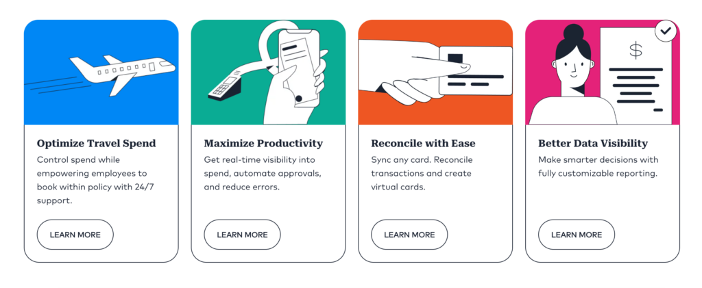
TravelBank is one platform for managing all your business travel, expenses, and card transactions, but at the end of the day, our community is more interested in the benefits they can expect from working with us. We help organizations optimize their business spend, maximize productivity, speed up reconciliation processes, and increase data visibility.
We’re Making It Easy to Navigate
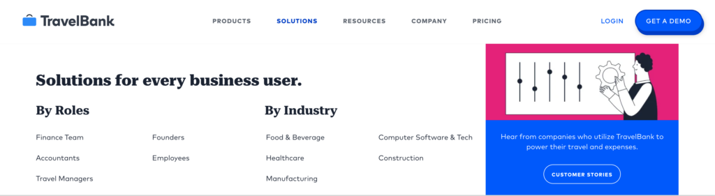
Our drop down menu has gotten a supersized new look on web. This new “mega nav” offers better (you guessed it) navigation so all of our pages, product information, services, and resources are easily accessible. The menu will still be fully accessible, in a mobile-friendly format, on mobile devices as well.
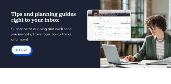
We’re Packing the Site with Relevant Resources
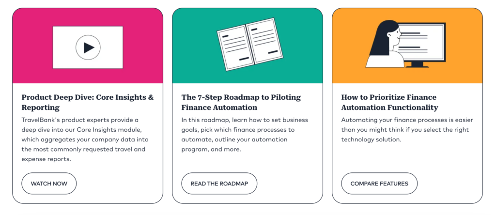
We’re also adding resources sections throughout the website so it’s always easy to find additional resources and information related to the content you are viewing. All of this is pulled from our recently improved resource page, where you can filter through dozens of webinars, research reports, product demos, and more.
We’re Improving Accessibility
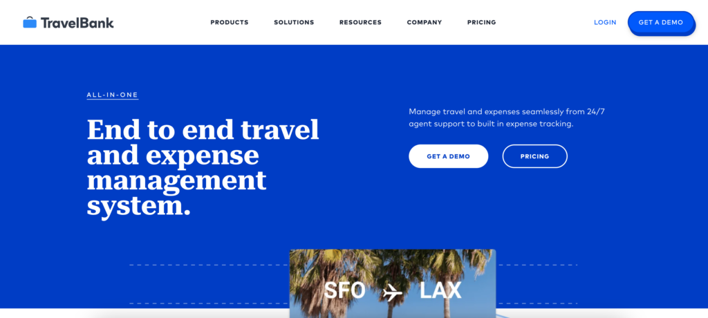
We’ve conducted an accessibility audit and update to ensure that TravelBank can be enjoyed by everyone. You may have already noticed our signature blue shade shifting to be a brighter, higher contrast blue. With these changes, our customers, app users, and site visitors will see an improved experience throughout our website and web application.
We’re Going Deep Where It Matters
After analyzing web traffic behavior, we’ve identified where our site visitors are spending most of their time and what information they are frequently looking for. On pages where visitors are usually doing research, like our product pages, we’ve added more information and loads of new frequently asked questions.
And Otherwise Keeping It Sweet and Simple
Overall, the goal of this refresh was to ensure fresh, relevant content and consistency across our website experience. The new font styles, colors, illustrations, and page designs help keep things looking streamlined and professional, so our website visitors can find and focus on the information that’s important to them.